
Category: Map of the Month
May Map of the Month
By: Grace Parker


Source by: American Community Survey
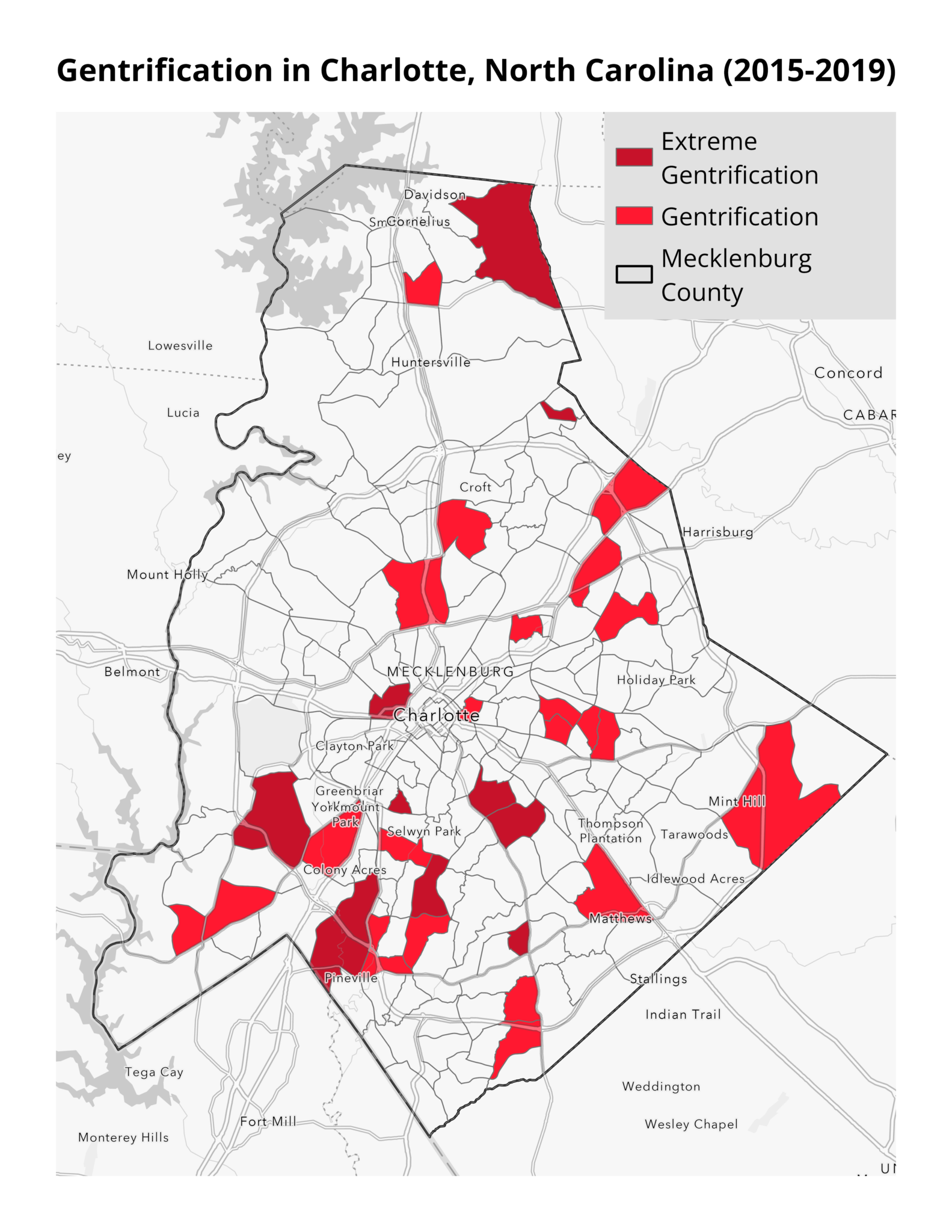
Unprecedented federal funding for underserved areas under the Justice 40 Initiative has the potential to mitigate the legacy of historical disinvestment in these communities. At the same time, new investments may contribute to gentrification if they fail to maintain the area’s affordability. Gentrification is the process by which lower-income households are displaced as their neighborhoods become less affordable—often due to rapidly rising rents or taxes —and it can be caused by the development of in-demand housing, businesses, and amenities. In many neighborhoods, this displacement disproportionately affects Black and Hispanic residents.
This month’s map highlights areas experiencing gentrification in Charlotte, North Carolina between 2015 and 2019. Our analysis finds that suburban communities in Charlotte have experienced the most rapid gentrification during this time. Areas like Davidson, Mint Hill, and Pineville have experienced sharp increases in the proportion of college-educated residents and in housing costs, for either renters or homeowners. In extremely gentrified tracts, on average, the proportion of college-educated residents increased by 9%, home values by 46%, and rental costs by 23% compared to 4%, 26%, and 18%, respectively, for lower-income tracts in general. It’s important to note that this method, created by Drexel University’s Urban Health Collaborative, of identifying gentrification does not take changes in racial composition into account, a component of other methods of identifying gentrification.
Gentrification is not unique to the South, but large Southern cities have experienced significant recent development that has put pressure on long-time residents. Our analysis focused on Charlotte as a case study of these booming Sunbelt cities that have been understudied, but other cities in the South—including Miami, New Orleans, and Nashville—are gentrifying even more rapidly.
Energy efficiency upgrades can help keep housing affordable by lowering energy costs and giving long-time residents savings that can be used to meet escalating housing costs. These measures are also important in enabling residents to pay for other necessities such as food and medicine and to prevent evictions.
Without careful design and execution, however, energy efficiency programs have the potential to increase the risk of gentrification by increasing rents and home values. This is sometimes called low-carbon gentrification.
Mechanisms to prevent low-carbon gentrification are critical and well-established. They can include agreements that prevent landlords from raising rents for a period after receiving energy efficiency upgrades. As Bipartisan Infrastructure Law and Inflation Reduction Act funding is invested in the Southeast, energy efficiency measures stand out as a mechanism to improve the quality of life in disinvested areas without displacing longstanding communities.
April Map of the Month
By: Laura Diaz-Villaquiran

Source: Union of Concerned Scientists, “Killer Heat in the United States” U.S. Census Bureau, Physical Housing Characteristics for Occupied Housing Units
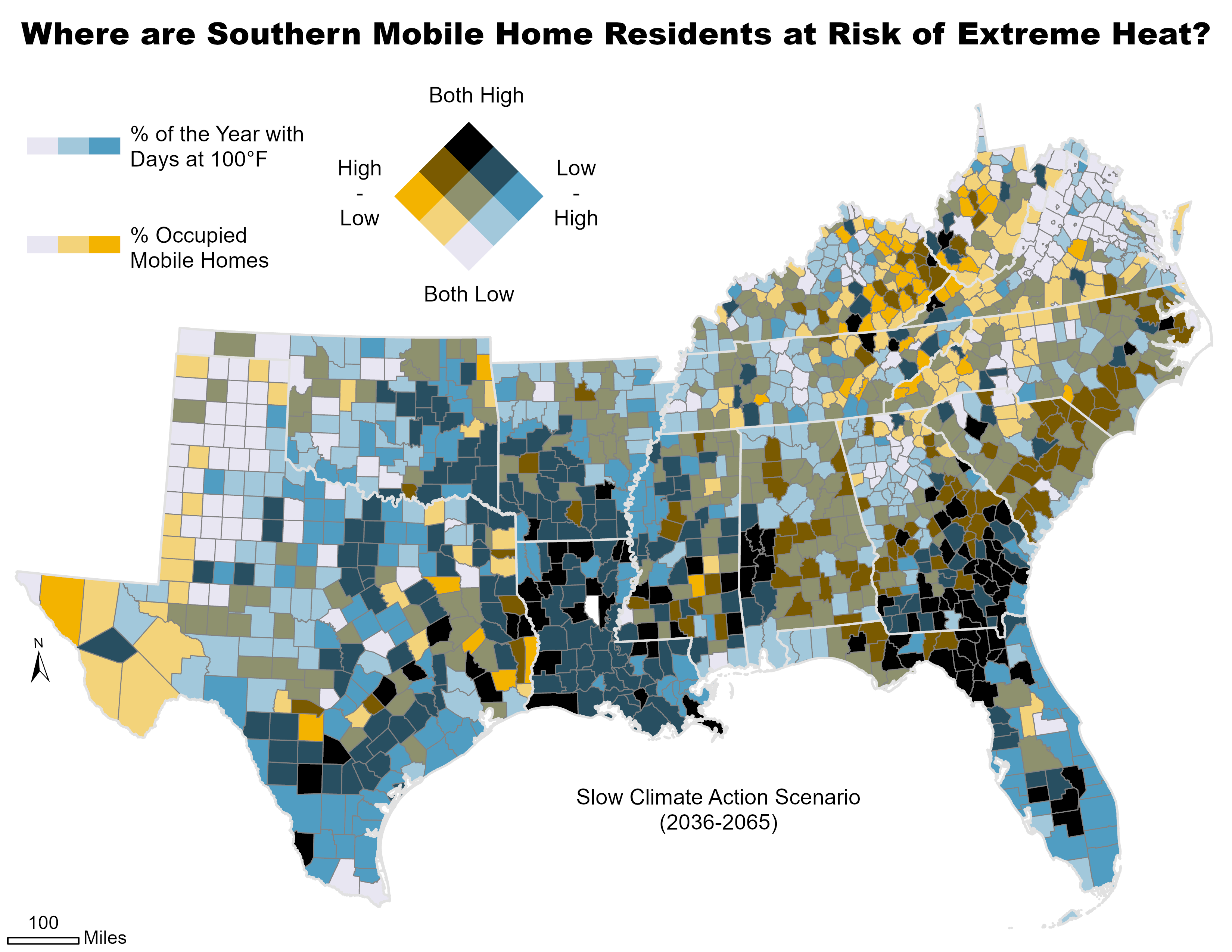
Extreme heat is the leading cause of weather-related death in the United States, and Southeast communities are particularly vulnerable to heat impacts as the climate warms. This vulnerability is not distributed evenly across the region, however. Research suggests that residents of mobile homes are among the most vulnerable to the impacts of extreme heat, with one 2021 study finding that mobile home residents are six to eight times more likely to die from heat-related illness than people who live in other types of housing.
The South has the nation’s largest share of mobile homes, and this month’s map considers where mobile home residents may be at the highest risk from expected increases in the prevalence of extreme heat by the middle of the century (2036-2065). Counties on the map shaded in dark blue have a high proportion of mobile homes—at least a quarter of the occupied housing units in those counties—and a high percentage of days with heat index values above 100°F. As the map indicates, these factors are overrepresented in counties in Florida, Texas, Louisiana, Georgia, Alabama, and Mississippi.
Research shows that people may experience elevated health risks —including respiratory and cardiovascular issues that can result in death—when exposed to temperatures of 80°F or more. Risks depend on a range of factors, including the length of exposure, physical activity, overall health, local environmental conditions, and how acclimated people are to those conditions. Outdoor workers, children, elderly people, those who are pregnant, and people with underlying health conditions are most susceptible. These risks can be magnified by housing quality and access to affordable energy. A report from the Union of Concerned Scientists notes, “When nights remain hot, health risks rise, especially for those without access to air-conditioning or for whom the choice of turning on the air-conditioning presents difficult financial trade-offs.”
These issues are often magnified in mobile homes, which, on average, have energy costs that are double those costs in stick-built homes. Recent estimates from the U.S. Census Bureau’s Household Pulse Survey indicate that 37% of people living in mobile homes, and earning less than $25,000 a year, kept their homes at an unsafe temperature to offset their cost-of-living expenses. Additionally, mobile home residents are more likely to face other “concentrated disadvantages” that include high energy burdens, lower-than-average incomes, a greater likelihood of living in rural areas that lack robust health and social services, and more.
Understanding future scenarios like this enables us to anticipate challenges for individuals residing in mobile homes while helping identify opportunities to leverage energy efficiency to mitigate heat-related illnesses and improve resiliency. These approaches could include home weatherization, implementing high-energy efficiency upgrades, and renewable energy retrofits. Additionally, targeted state and federal funding could prioritize communities that are most at risk of experiencing extreme heat in the coming decades.
March Map of the Month
By Grace Parker
Source: Federal Communications Commission
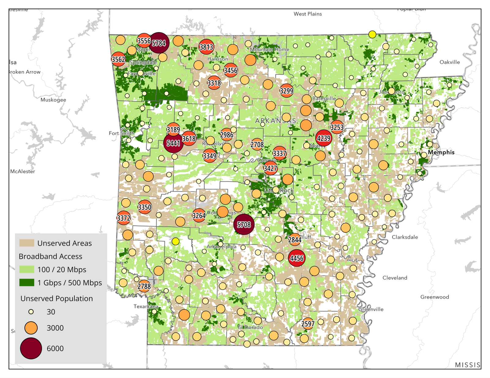
In today’s interconnected world, broadband is not a luxury; it is a necessity. Broadband influences many facets of life, from access to education to employment opportunities and even health. Access to broadband is also critical to monitoring and reducing residential energy use. Many energy technologies, such as smart thermostats and smart meters, require broadband connectivity to function, while most energy assistance programs rely on online applications for aid. Households that have limited access to broadband can find it more difficult to make use of energy efficiency assistance and have fewer tools to monitor and reduce home energy use.
Drawing on data from the Federal Communications Commission (FCC) this month’s map shows the population in Arkansas without high-speed broadband access. Arkansas has about 251,000 households who lack adequate broadband access. At 14.3% of the state’s households, it’s one of the highest rates in the United States. That number increases to 17.4% when you account for those who have access to broadband infrastructure but do not have a subscription, likely because of affordability challenges. This problem extends across the South, with a 2009 report finding that the South had the lowest rate of broadband use and the greatest urban-rural divide.
The FCC defines high-speed broadband as 100/20 megabits per second (Mbps), or 100 Mbps of download speed and 20 Mbps of upload speed. The FCC also set a nationwide goal of 1 Gbps/500 Mbps, which is currently only available in urban parts of Arkansas. This map likely underrepresents the population unserved by high-speed broadband since all the residents of a census block are considered served if anyone within it has access.
The map highlights the difficulty broadband providers face in reaching rural areas, showing how, across the state, there are small, dispersed groups lacking broadband that will require significant investments in infrastructure by providers. Meanwhile, there are larger groups in more populated areas that still lack broadband access, which are more likely to be economical investments for providers.
The lack of high-speed broadband and the energy efficiency measures it enables contribute to a concentrated disadvantage. Nationally, rural energy burdens are 40% higher than those in urban areas. Since most smart energy-saving devices communicate through the home’s broadband, these households have fewer opportunities to monitor and reduce their energy use. Energy assistance information and applications for programs such as the Weatherization Assistance Program (WAP) and utility offerings are often online, making it more challenging for these households to pursue energy efficiency upgrades.
The Department of Commerce is investing over $1 billion in Arkansas and $12.8 billion in the Southeast as part of the “Internet for All” initiative, but some stakeholders and experts have expressed skepticism that this will be sufficient for making broadband universal. Electricity-broadband partnerships are one way to make the funding go further. These partnerships are expanding broadband coverage in the Southeast by sharing infrastructure, making it more cost-effective for broadband providers to reach dispersed populations. These partnerships include investor-owned utilities like Entergy and Alabama Power and many electric cooperatives. Electricity access – which is nearly universal in the United States from an infrastructure standpoint – far outpaces that of broadband, in part due to the work of electric cooperatives created to expand service into rural areas. These intersectional partnerships will be crucial to reaching the rural Southeast.
Map of the Month – February
Laura Diaz-Villaquiran
Hover over the map to click through the slideshow. Click on image to view full image.
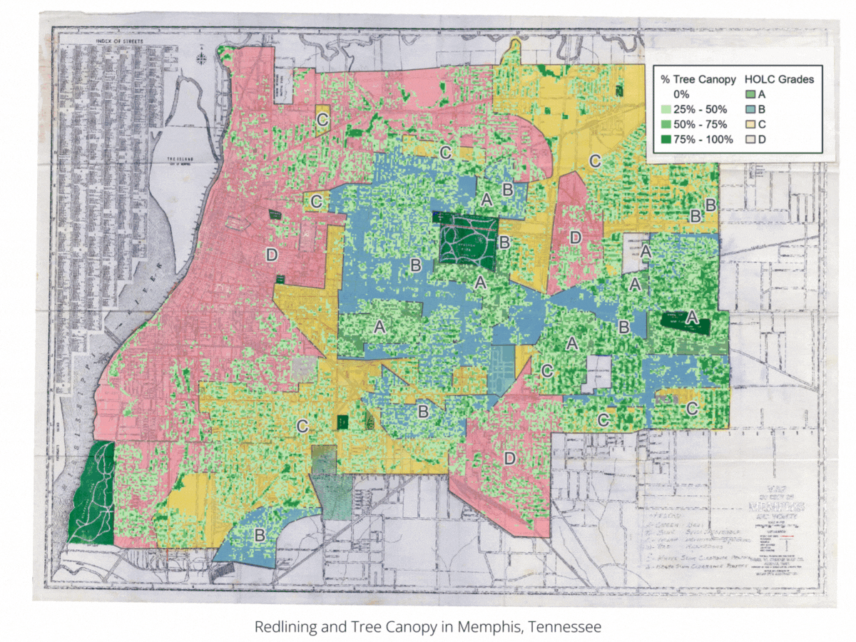
 Redlining and Tree Canopy in Memphis, Tennessee

")

Data Source: Mapping Inequality: Redlining in New Deal America Dataset; U.S. Forest Service Tree Canopy Cover (TCC) Dataset; Maps: SEEA.
Few things have impacted cities today as much as the suite of policies and practices that segregated neighborhoods on the basis of race over more than a century. Housing segregation had existed in practice for decades before the 1910s when white policymakers enacted the first racial zoning laws. Although these laws were declared unconstitutional by the United States Supreme Court in 1917, white city officials throughout the South still found ways to advance racial residential segregation.
In the 1920s and 1930s, segregation was taken up by the federal government in the form of “redlining,” the practice of denying financial lending – particularly for home purchases or improvements – to people based on their race or ethnicity and what neighborhood they lived in. For instance, the federal Home Owners’ Loan Corporation (HOLC) developed a series of maps that used the racial makeup of city neighborhoods to guide mortgage lending practices based on their assessment of the risk of lending. HOLC devised a four-tiered system that characterized neighborhoods in more than two hundred cities as A – best, B – still desirable, C – declining, and D – hazardous. These ratings were largely based on the racial makeup of a neighborhood, with C and D ratings typically having a larger share of racial and ethnic minorities than neighborhoods that rated A and B.
HOLC maps had less of an impact on private markets than often suggested, but they guided Federal Housing Administration (FHA) lending decisions for decades. Beyond that, they are also a spatial reflection of generations of policies and programs that segregated American cities, with far-reaching consequences that still shape cities today.
Using tree canopy cover data from the U.S. Forest Service, this month’s map explores the relationship between redlining and urban tree canopy. In three cities (Columbia, Jackson, and Memphis), we find that formerly redlined neighborhoods have about half the level of tree canopy today than historically white neighborhoods.
In Memphis, Tennessee, formerly redlined neighborhoods have an average tree canopy covering 20% of the neighborhood, while neighborhoods rated “A” have canopies that cover about 43% of their land area. In Jackson, Mississippi, formerly redlined neighborhoods had an average tree canopy of 24%, while neighborhoods rated “A” have 50% canopy cover. In Columbia, South Carolina, formerly redlined neighborhoods had 15% tree canopy, compared to 32% for non-redlined neighborhoods.
These findings are consistent with national studies, which demonstrate how the legacies of residential segregation continue to impact people of color. This results in uneven access to public greenspace, less shade from trees, hotter temperatures, and poor air quality which can lead to more heat-related illness and asthma rates. Increased temperatures can place higher energy demands and financial burdens on people living in these areas, which will further strain health and household budgets as extreme heat becomes more common in the next few decades.
These implications underscore the need for comprehensive energy efficiency, clean energy, and urban planning strategies to mitigate adverse impacts. They also show that energy efficiency is an intersectional issue that must be advanced through collaborative efforts across sectors, including energy, public health, urban planning, and development.
Map of the Month – January
Grace Parker
Data Source: EIA Annual Electric Power Industry Report Form EIA-861 Dataset; Graph: SEEA
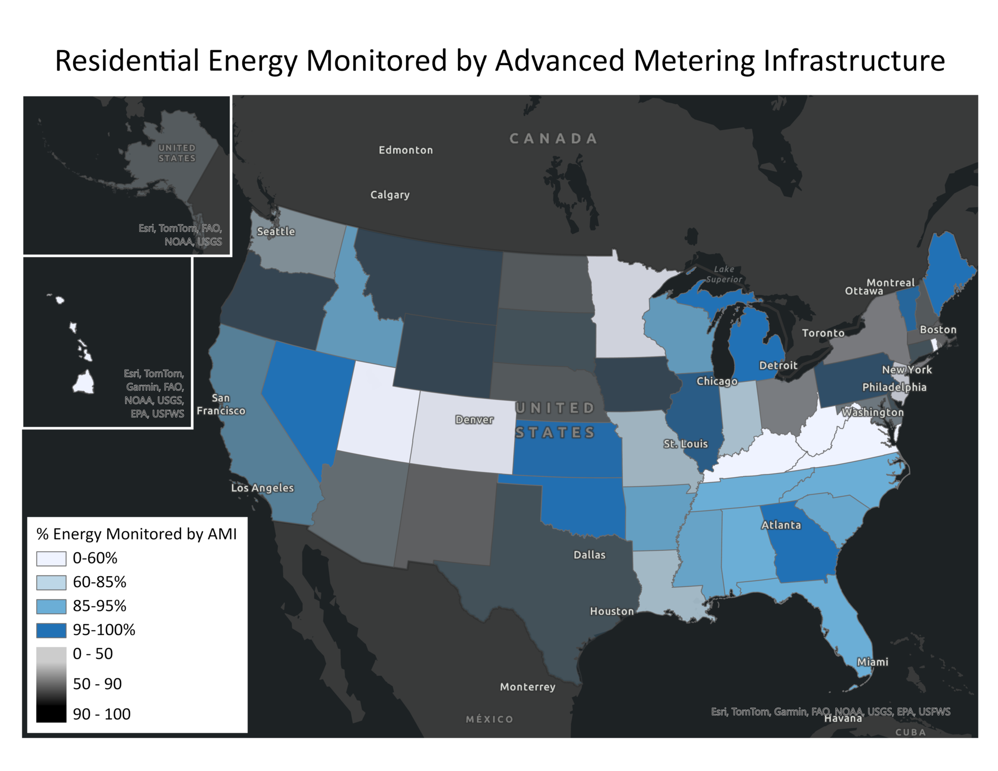
Accessing household energy data is critical to developing effective and evaluating efficiency programs, deploying energy assistance, and managing home energy use. Yet the accessibility of this data varies widely. One way to explore the accessibility of energy data is through Advanced Metering Infrastructure (AMI), a technology that monitors household energy usage, sends the encrypted data to the utility, and can communicate information back to the customer. A previous technology, Automated Meter Readings (AMR), allowed utilities to access real-time energy usage data but did not allow two-way communication with customers. The potential benefits of AMI include real-time energy adjustments by customers to lower bills, usage and outage notifications, and time-of-use pricing that encourages customers to shift energy use to times with lower energy prices. Because AMI provides granular data on energy usage, it can also be used to target and evaluate programs or policies for maximum impact and customer benefit.
This month’s map shows the percentage of residential energy sales (in MW) in each state that are monitored by AMI, as reported by electric utilities to the Energy Information Administration (EIA). The transparency of the map corresponds to how representative the data reported is of the state’s residential energy sales; states in which utilities report sufficient data for a high percentage of their energy sales appear opaque, while states in which utilities did not appear transparent. Both the percentage of energy tracked by AMI and the completeness of the data reported by utilities vary dramatically. The Southeast overall has a high rate of adoption with six states exceeding 90 percent of energy monitored by AMI, and the Southeast has some of the most complete data in the United States. In areas with low AMI adoption rates, its cost may be a barrier. AMI is more expensive than AMR, so ratepayers would first have to pay for the upgrade before realizing energy savings.
Even in areas that appear to have high adoption of AMI, there may still be barriers to accessing the data. A report by Mission: data national coalition of technology companies that works on energy data access—found that of the more than 17 million advanced meters funded by the American Recovery and Reinvestment Act in 2009, less than 3% have real-time data features enabled.
Some customers may even be unaware that they have AMI. According to the Residential Energy Consumption Survey, only 28% of households in the U.S. reported having an electricity “smart meter” in 2020, despite utilities reporting that about 65% of residential customers had one.
The data used in this map, which is reported unevenly to EIA and only covers around 70% of residential energy sales in the United States, underscores additional barriers to energy and data accessibility. As regulators and researchers continue to address data access issues, they must work with utilities to ensure the full benefits of AMI are realized and to understand the challenges to obtaining and reporting complete, high-quality data.
To this end, SEEA is launching a working group, as part of our Southeast Energy Insecurity Project (SEIP), to explore pathways to build data transparency around energy and housing data so that this data can be leveraged to address energy insecurity through policies and programs. If you, or your organization, are interested in digging into this issue as a member of a SEIP working group, please reach out to Will Bryan, SEEA’s Director of Research, at [email protected].
Map of the Month – December
Grace Parker
Source: Federal Financial Institutions Examination Council, Home Mortgage Disclosure Act Dataset; Graph: SEEA
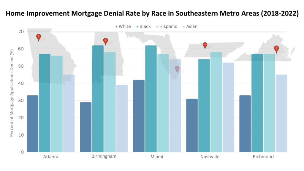
Following last month’s map that explored home purchase mortgage denial rates by race, this month’s map shows home improvement mortgage denial rates by race in five Southeast cities: Atlanta, Birmingham, Miami, Nashville, and Richmond. Like mortgage loans for home purchases, we found wide disparities between racial groups in their ability to access lending for home improvements. Using data collected by the U.S. Consumer Financial Protection Bureau to ensure compliance with the Home Mortgage Disclosure Act, we discovered that the denial rate for home improvement loans in each city is highest for Black and Hispanic applicants, followed by Asian applicants, with white applicants experiencing the lowest rates. In Birmingham, the denial rate for Black applicants is twice that of white applicants.
In each of these cities, denial rates for home improvement mortgages are generally higher than those for home purchase mortgages. Home Mortgage Disclosure Act regulations consider home improvement loans as those that are “for the purpose, in whole or in part, of repairing, rehabilitating, remodeling, or improving a dwelling or the real property on which the dwelling is located.” This includes home improvement spending built into mortgages for home purchases or lines of credit opened for home improvement if the home itself is used as collateral on the loan.
According to the U.S. Census Bureau’s American Housing Survey, about a third of home improvements in the Southeast are for energy efficiency measures. Limited access to capital for home improvement hinders the ability of homeowners, particularly Black, Hispanic, and Asian homeowners, to make energy efficiency upgrades. This further contributes to racial disparities in energy costs and burdens and makes it more difficult for people of color to access healthy, efficient and affordable housing.
Map of the Month – November
Grace Parker
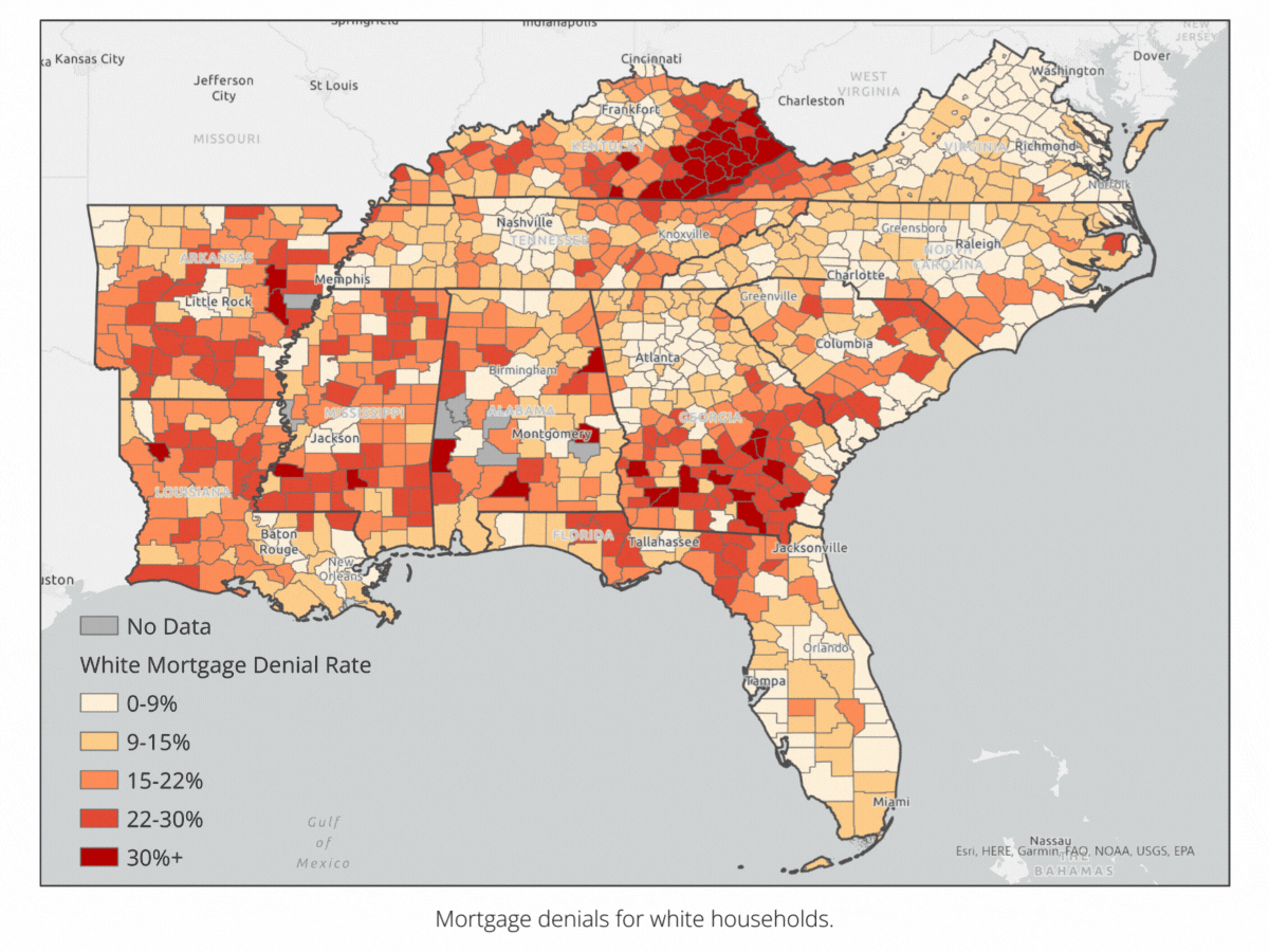
hover over the map to click through the slideshow
- Mortgage denials for white households.


Source: Dynamic National Loan-Level Dataset, U.S. Consumer Financial Protection Bureau; Maps: SEEA
Redlining and other forms of housing segregation officially ended in 1968 with the Fair Housing Act, but access to lending still differs depending on a person’s race. People of color are still more likely to be denied access to mortgage lending than white people. Homeownership is the most common pathway to building generational wealth in the United States and limiting access to capital for buying a home not only prevents people from healthy, safe, and affordable housing and inhibits social mobility.
This month’s map tracks disparities in mortgage lending throughout the Southeast using data collected from federally- backed lenders as part of the Home Mortgage Disclosure Act (HMDA). It shows the mortgage denial rate by race among counties in the Southeast between 2018 and 2022. As housing costs and high- interest rates raised monthly mortgage payments, lenders denied around 12 percent of home purchase mortgage applications in the Southeast. However, the applicants are not denied evenly. Between 2018 and 2022, about 10 percent of non-Hispanic white applicants, 8 percent of Asian applicants, 14 percent of Hispanic applicants, and 21 percent of Black applicants in the Southeast were denied mortgage loans.
In 2022, the most common reason for mortgage application denials was insufficient income. Income also varies by race. The median non-Hispanic, white household income in 2022 was $81,000; Asian household income was $109,000, Hispanic household income was $63,000, and Black household income was $53,000. Inequities in income, lending, and the ability to build wealth impact a household’s ability to access safe and healthy housing. A lack of mortgage capital also makes it difficult for people to access the benefits energy efficiency, whether through housing choice or home retrofits. Stay tuned for a forthcoming map on lending for home improvements, which will shed light on the ability of households to achieve energy efficiency savings through home improvement capital.
Map of the Month – October
Grace Parker
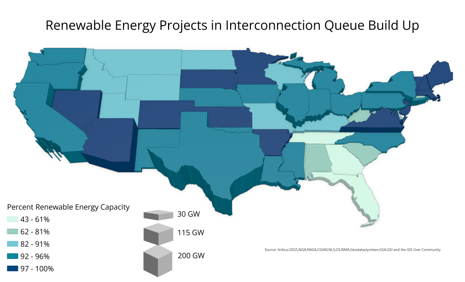
The Inflation Reduction Act (IRA) and other recent federal developments provide unprecedented opportunities to hasten the energy transition through the development of renewable energy resources. Yet this progress is being hindered by the backlog of energy projects waiting in the interconnection queue, a phase in which energy developers request to connect to the power grid and complete studies about the impact of these connections. The number of projects waiting in the nation’s interconnection queue grew by 40 percent in 2022 as more renewable energy projects were greenlit. The amount of time each project spends in the queue is also growing. Projects completed in 2022 spent an average of five years in the queue, compared to less than two years for projects completed in 2008.
These delays threaten project feasibility, potentially undermining the transition to renewable energy. During waiting periods, project terms, including how much consumers will pay for electricity and the availability and costs of proposed real estate, are likely to change, which leads to projects being abandoned. Less than a quarter of the projects in the queue are expected to be completed.
This month’s map shows the total capacity of energy projects in the queue for each state, and how much of each of this capacity is in renewable energy projects. The data, from Lawrence Berkeley National Laboratory, includes seven independent system operators and 35 utilities, representing about 85% of the U.S. electricity load.
Texas leads the country by far in total capacity in the queue with about 200 GW, followed by California and Arizona, with about 113 GW each. Interconnection queues are managed by regional transmission organizations and utilities, so the total capacity in the queue indicates both interest in building energy projects and the efficiency of queue managers.
The proportion of capacity that is renewable energy is high overall, with only seven states below 80 percent. The relatively large backlog of projects in the queue in other regions might be due in part to the lack of long-distance, high-capacity transmission lines on which renewable energy projects typically depend. Lacking this infrastructure, renewable projects are more challenging to connect to the grid, contributing to long periods in the queue.
The Federal Energy Regulatory Commission issued a rule reforming the interconnection process in July by streamlining permitting, instituting deadlines and fines for delayed assessments, and instituting financial requirements to cut down on speculative projects. But many experts still say that more system reform is needed to meet clean energy goals. While policymakers are working on additional changes to the interconnection process, energy efficiency upgrades are critical for preparing homes and commercial buildings to realize the maximum benefit of renewable energy supplies.
Map of the Month – September
Grace Parker

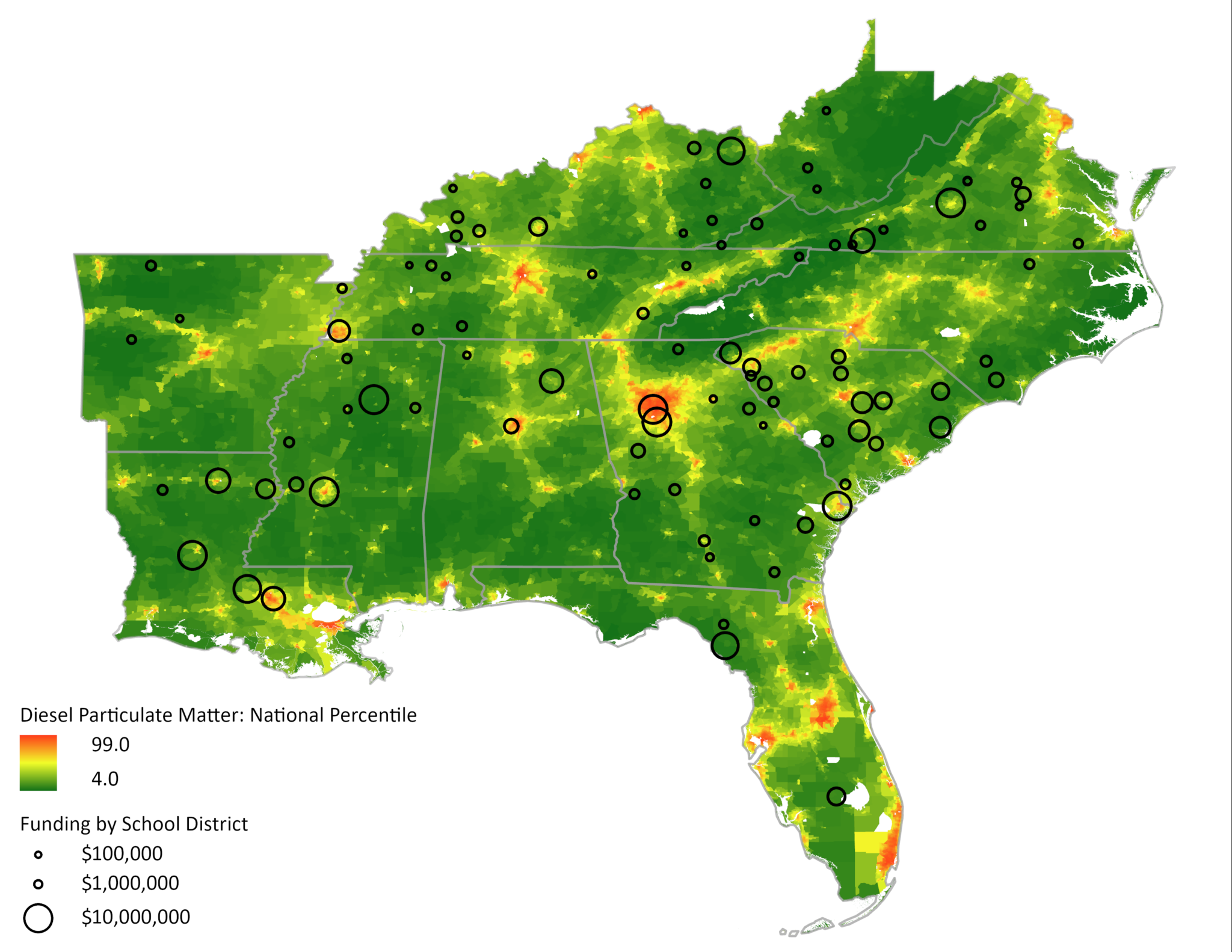
Map: Southeast Energy Efficiency Alliance
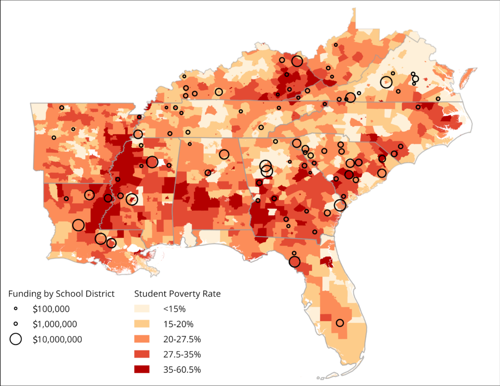
Map: Southeast Energy Efficiency Alliance
The EPA’s Clean School Bus Program aims to reduce greenhouse gas emissions and exposure to air pollution by replacing older school buses with low-emission and zero-emission models. Has that funding reached the communities most impacted by the harmful effects of diesel school buses? Diesel buses produce diesel particulate, which has been linked to an increased risk of asthma and cancer. A part of the Bipartisan Infrastructure Law, the Clean School Bus Program provides funding to school districts to purchase new low-emission and zero-emission buses. This funding supports a global reduction of greenhouse gas emissions, local air quality improvements, and health benefits to nearby communities.
This month’s maps show that the school districts that were awarded program funding in 2023 are generally more rural, have high student poverty rates and lower levels of diesel particulate, especially compared to more urban districts. The EPA prioritizes funding for rural school districts, high-need local education agencies, and schools that serve residents of Native American lands. High-need local education agencies include districts where 20 percent or more of students served are from low-income families. The student poverty map shows that most of the funding went to these districts. The Clean School Bus Program largely supports schools that have smaller budgets and serve students from lower-income communities.
This month’s maps reveal a tension between funding districts that have the most difficulty paying for clean school buses and funding districts with the highest diesel particulate pollution. However, we can target funding to areas that need support to overcome both of these challenges, like New Orleans. Although a district with similar needs in Birmingham received a $3.6 million grant, New Orleans districts did not. School districts seeking cleaner air and better health for their communities need additional outreach and technical assistance to support their funding applications to the Clean School Bus Program. By focusing on districts that face multiple obstacles to their achieving their goals, we can deepen the impact of this historic and critical funding.
Map of the Month – August
Grace Parker
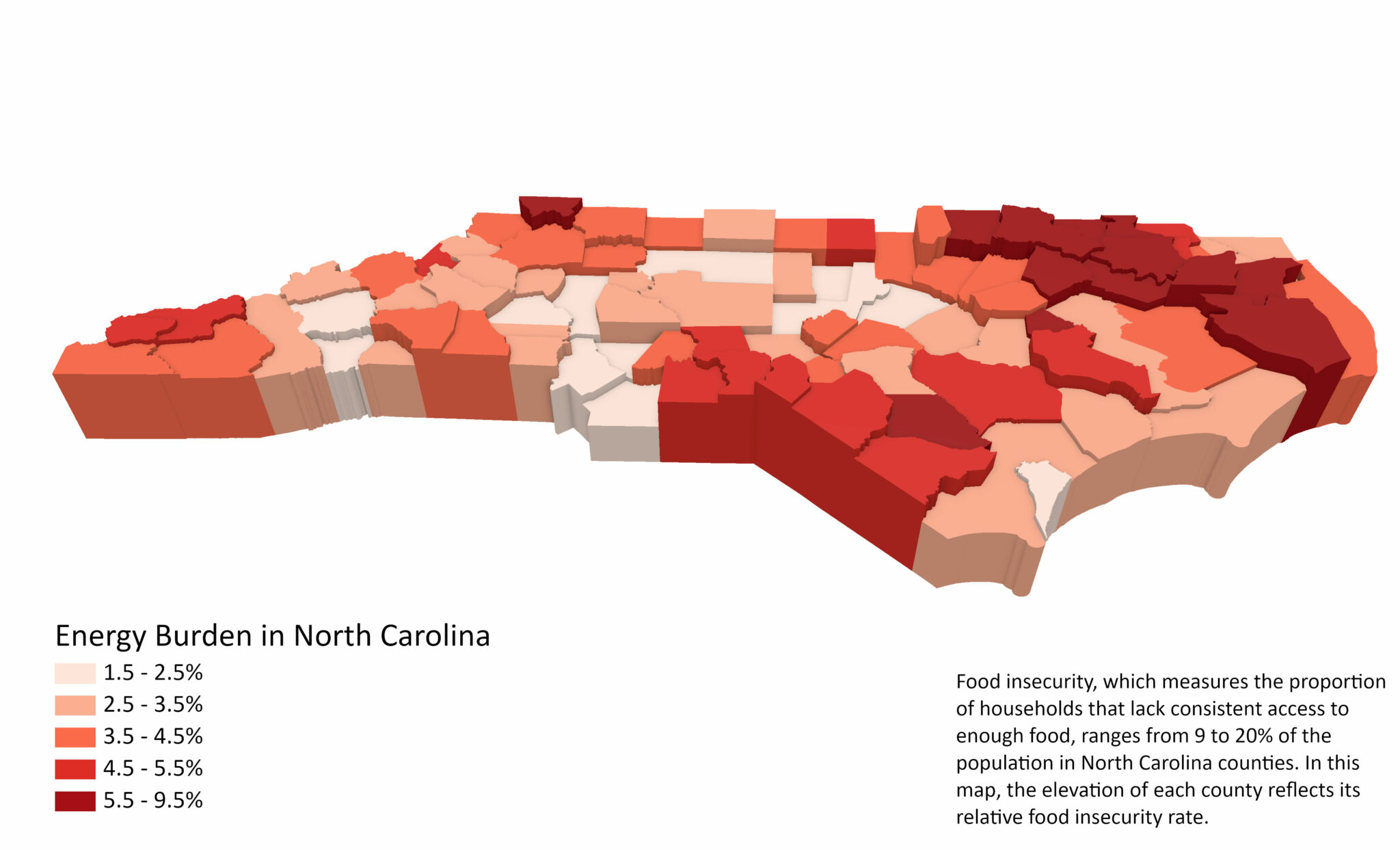
A household’s high energy bills are more than just a heating and cooling problem; they can force low-income households to choose between paying for utilities, groceries or medicine. Studies demonstrate that difficulty covering energy and food costs are often intertwined. Hardship paying energy bills, particularly during extreme heat or cold periods, often makes it more difficult for low-income households to purchase enough food, known as the “heat or eat” dilemma. According to the 2022 Residential Energy Consumption Survey from the U.S. Energy Information Administration (EIA), nearly 7 million households in the Southeast have cut back on food or medicine to pay their energy bills, most likely due to cooling costs rather than heating.
This month’s map compares energy costs with food insecurity in North Carolina, where counties with high energy burdens tend to have higher rates of food insecurity. In these counties, high energy burdens are not the only cause of food insecurity, but the people living here are likely choosing between paying energy bills and buying food.
Rural North Carolina counties have higher than average rates of energy burden and food insecurity. In contrast, metropolitan areas like the Research Triangle, Charlotte, Greensboro, and Asheville have lower rates of energy burden and food insecurity. Counties in northeast North Carolina near Kitty Hawk have the state’s highest energy burden and food insecurity rates. The correlation between places that struggle with high energy costs and food insecurity underlines the importance of energy efficiency and weatherization. These programs help households maintain a comfortable and safe temperature, resulting in lower energy costs and more money for other necessities like food.